Reprinted from dev.to

Today I’ve been going through slides with fellow graduate student and came up with an analogy:
Each pixel of your slides costs you money
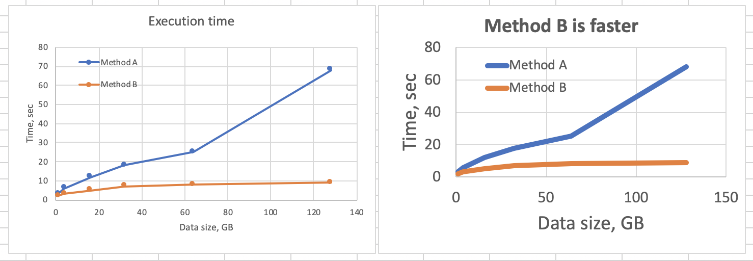
Now, consider how much you get back from each of the pixels you put out there. Was it really worth it? How much information did you provide, and how much have you paid for it?
In a sense, it is similar to “Data-ink ratio” idea introduced by Tufte. Difference is that “money” approach brings actual numbers to the stage.
When you put stuff on a slide, or on a plot, do you really get the most bang for the buck?
Most of the time, especially for the first 4 drafts, the answer is “no”.
How to get higher return on pixel?
- Simplify: slide has to carry a message, how much simpler can it get?
- Split: there has to be single message, can you say one thing at a time?
- Squestion: does
thishas to be here?

One thought on “Each pixel of presentation costs you $$$”