Call for providing better working conditions for researchers

Current US regulations of workplace benefits, accommodations, and options are terrible. This stems from a long past of aggressive capitalism fueled by communism/socialism fear-mongering. One example is at-will employment laws that disproportionally shift power from workers to companies.

Other regulations and practices are accepted historically. For example, open plan office spaces that have been proven to be terrible for productivity specially in creative work. Some of these decisions are driven by attempt to save money, others by ignorance and lack of empathy.

Fortunately, many companies come to realize that there are things that make workers happier, more productive, and efficient, while perhaps costing a little bit of money to the company. Basecamp offers exceptional benefits which not only save money to the employees ($100/month fitness allowance, $1000/year continuing education allowance, paid 16-week parental leave) but communicate:

We respect you and want you to be happy and life is hard enough

That is reflected by the 4-day work week during summer and the 1-month sabbatical every 3 years. Basecamp, arguably, makes a lot of money and as a private company capable of making these decisions. Other organizations might not have enough fiscal or political capital to advocate for better benefits or work conditions, being forced to follow “corporate regulations” or “it always been like that”.

That will not stop us from asking for, and in some circumstances, demand more respect and more responsibility from organization where we work. Here is a list of facilities that we think are necessary and should be provided to all researchers, students working in labs, and staff in any institution:

Some of these items have been requested and received at my previous institution, others not yet successfully implemented. There is always room for improvement, and we should start with a list of necessary improvements to the workplace and then collaborate with institutions to increase happiness and productivity in academic environment.
We need more clear plots with high information density

When presenting data we’d like to balance two goals:

  1. Present finding in a clear, unambiguous fashion
  2. Reflect variation in data and observations that go against the hypothesis

This should be also combined with the notion that Every pixel costs you money.

When highlighting difference between conditions, we can condense data in different ways. For example, we can start with bar graph with error bars. Asterisks signify significance level (p-value) of the difference between two conditions.

Bar chart with error bars compared to Gardner-Altman plot. Gardner-Altman plot shows data points as well as an inset that highlights what’s important: the difference between means of the two distributions and confidence interval. “+1.15C” is a bit confusing identification of that difference because it just “floats” in the space.

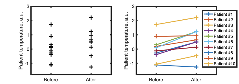
If we know that two conditions are applied to same sample (for example, we measure temperature of patient #1 before and after treatment) then it might be useful to show that using lines:

Example of line plot to show change in parameter before and after treatment. While most patients improved, there are some outliers. Paired-sample t-test, p<0.01

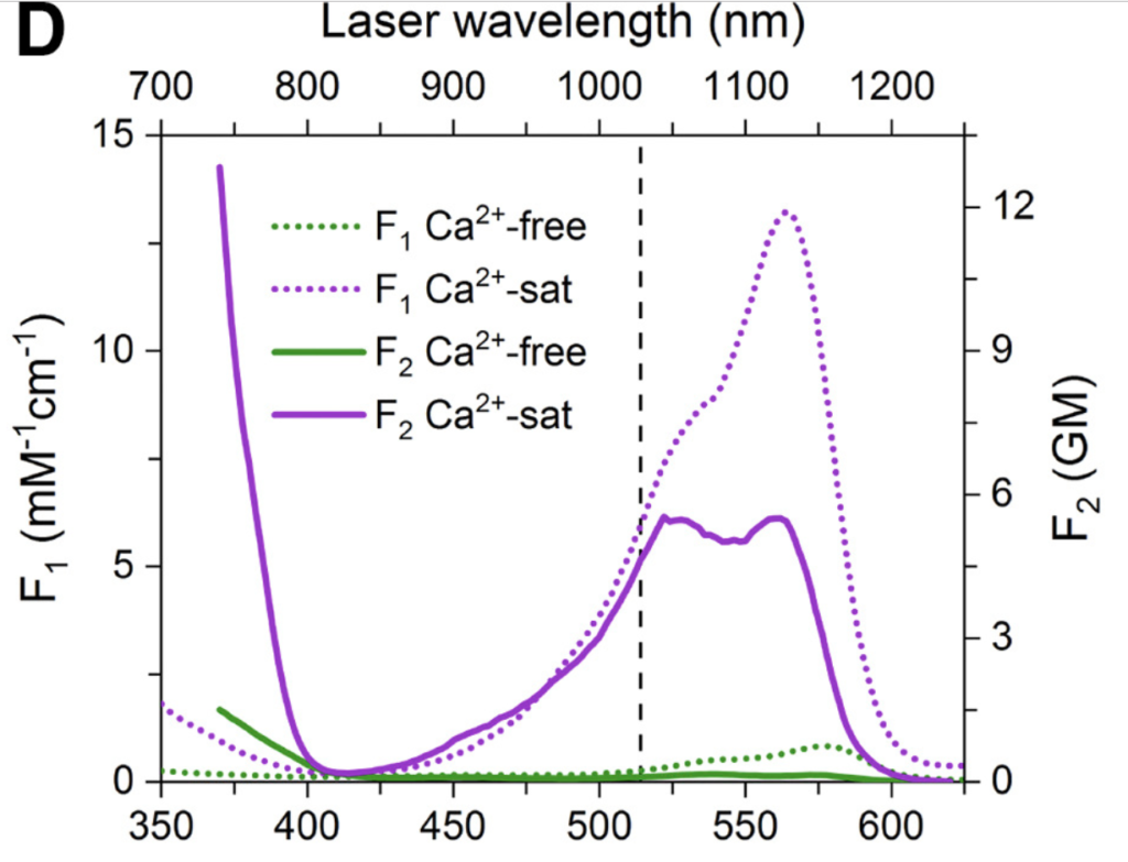
We sometimes want to show bunch of different stuff on the same plot. Consider this graphics, that overlays multiple fluorescence excitation spectra:

Spectral analysis of fluorescent variants GECO, Understanding the Fluorescence Change in Red Genetically Encoded Calcium Ion Indicators

It took me a lot of time to understand it, because it uses two sets of axes for each subplot. That can be an effective tool, and can be easily implemented, say in MATLAB [example one] [example two], but it can also cause confusion. Let’s focus and try to improve single panel:

Panel D. Color represent amount of Ca2+ ions, texture represents single- (F1) or two-photon (F2) excitation modes

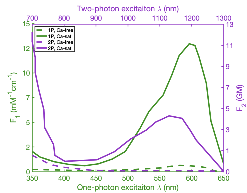
The plot is using color and dashing in order to define 4 different spectra of a calcium-sensitive fluorescent protein. Dashing is used to signify excitation mode (single-photon or two-photon) and color is used to mean presence or absence of calcium. This plot can be improved by flipping this relationship, keeping dashing for calcium amount, and keeping color for illumination mode:

Revised plot. Color now means means imaging conditions and matches axis

We can see, that least important information (plot of calcium-free fluorescence) is now hidden by dashing, and important stuff (the spectra of excitation) is elevated. We also color-coded the graph lines, as well as axis, so that two graphs can be viewed in the same panel, but also be distinguished visually: the purple line is being read using purple axis, and the green line is being read using green axis.

As final note, few resources on making graphics clear and statistically sound:

Run Journal Club as a project meeting

A lot has been written about Journal Club meetings in academia and medicine. It mostly boils down to something like “10 ways to kick-ass at journal club presentation” or similar. There is not much discussion on how to make Journal Club an effective tool.

This stems from the fact that nobody treats Journal Club meetings as business meetings. Journal Club becomes a “discussion” in a terrible sense: there are no quantifiable goals, no concrete questions to be answered, no tangible results that can be recorded. Perhaps one exception is clinical journal clubs where the concrete question is whether given research paper helps us to treat patients better.

In academic circles goal of the Journal Club is often “to keep up with the recent research” or “sharpen debate skills and critical thinking”. This is nebulous, unmeasurable, ultimately unachievable in any progressive fashion. The goal of this article is to offer tools that would make JournalClub meetings more productive by specifying set of goals.

First, person in charge of the Journal Club (the main stakeholder in the group) should state clearly goals of the meeting. For example, PI can say (and regularly repeat):

I want us to read papers and learn what experiments we can do better than others using our awesome technology

Or perhaps, we want to learn new statistical methods; or new optical techniques; or new model organisms. Or we want to borrow experimental approach; or compare our approach to another group’s one. That doesn’t matter, what matters is trying to be precise in the language.

That naturally allows for deliverable at the end of the meeting. For example:

  • List of statistical methods, that were used properly, and should be learned
  • A comparison of published experiment with potential experiment achievable with technique available in your lab
  • A published experiment that we should do with another transgenic line or animal model
  • An engineering trick that can be borrowed or improved
  • List of mistakes authors made, including wrong methods or strong assumptions
  • Critique of the figures for clarity and information density; how figures can be improved

When the goal is set precisely, the meeting turns into a work meeting to achieve a goal, and not a discussion to kill time. Participants now have a sense of purpose, common goal, and at the same time responsibility. Members of the team know when the meeting is “done“, that is when the goal is reached.

Journal Clubs are often seem to be a terrible way to spend time, and we would argue that is because the goal-setting is too abstract or even never provided. The public and loud statement of the goal from the senior managers (PIs) would provide concrete reason for everyone to be in the room and simple checklist-style way to know that meeting is a success.

PS: useful general dichotomy can be “paranoid vs reparative reading

Free resources to practice programming languages

This short list covers few sources of practice for Python, MATLAB, R, and Javascript

MATLAB

Main source: official tutorial MATLAB Academy.

Bonus points for problems from MATLAB certification practice test.

Extra bonus points: online interpreter of Octave with functionality of shared coding. You can loop in another person to help you get through. GNU Octave is designed to be compatible with MATLAB syntax

Python

Interactive Python exercises

36 exercises for learning Python. It does require having development environment set up, and might require someone to help you at the beginning.

R and RStudio

Swirl is a library that you run inside RStudio, that guides you through tutorial

There is also an interactive online tool, LearnR hosted on RStudio’s Github

Javascript

There are many services that allow practicing JS. But we like Javascript because it can be useful for programming dynamic data visualization. Online platforms such as Glitch, Codepen or JSFiddle allow free-of-charge prototyping and sharing of small web applications.