Nobody cares until they have an empty box in their head
Why are you presenting and talk about A when the audience wants to hear about B? Well, for example, because A is the only thing you know how to talk about?…
If the audience of undergrads is looking for a lab rotation or research experience, don’t tell them about textbook molecular biology you are working on. Tell them how your day looks, and how the lab space looks
If the audience wants to know whether your microscope is good for their problems, don’t give lecture on physics of light. Show images of samples and experiments that come out.
If the audience wants to go home and be left alone… present the absolute minimum amount that will satisfy your supervisor, and let everyone free. Seriously, everyone loves when meetings end early
Q. What if you get to Q&A sooner, but there aren’t any questions?
A. Everyone goes to get a beer! Seriously, if there are no questions it means all questions were answered or the audience isn’t interested. In both cases it’s time to go.
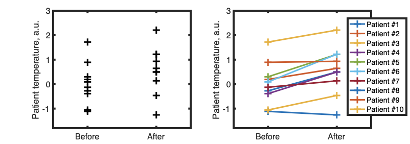
When highlighting difference between conditions, we can condense data in different ways. For example, we can start with bar graph with error bars. Asterisks signify significance level (p-value) of the difference between two conditions.
Bar chart with error bars compared to Gardner-Altman plot. Gardner-Altman plot shows data points as well as an inset that highlights what’s important: the difference between means of the two distributions and confidence interval. “+1.15C” is a bit confusing identification of that difference because it just “floats” in the space.
If we know that two conditions are applied to same sample (for example, we measure temperature of patient #1 before and after treatment) then it might be useful to show that using lines:
Example of line plot to show change in parameter before and after treatment. While most patients improved, there are some outliers. Paired-sample t-test, p<0.01
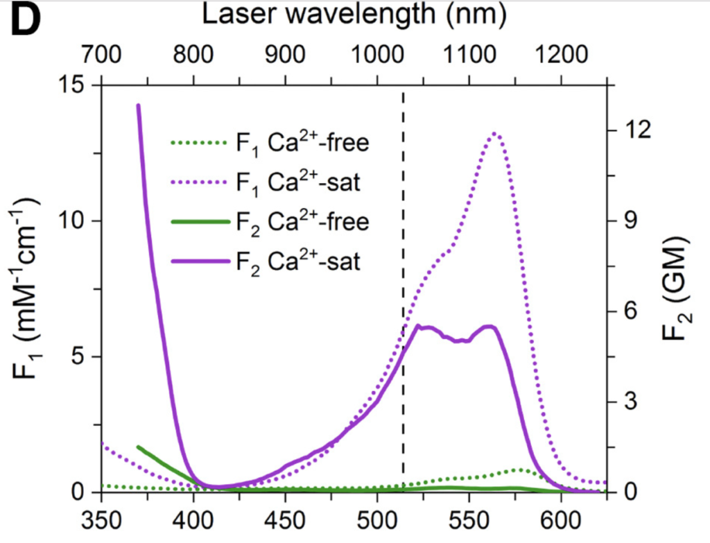
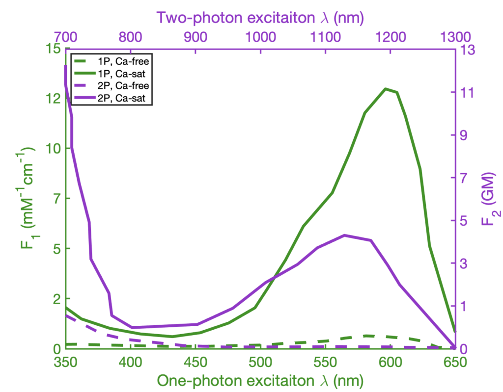
We sometimes want to show bunch of different stuff on the same plot. Consider this graphics, that overlays multiple fluorescence excitation spectra:
It took me a lot of time to understand it, because it uses two sets of axes for each subplot. That can be an effective tool, and can be easily implemented, say in MATLAB [example one] [example two], but it can also cause confusion. Let’s focus and try to improve single panel:
Panel D. Color represent amount of Ca2+ ions, texture represents single- (F1) or two-photon (F2) excitation modes
The plot is using color and dashing in order to define 4 different spectra of a calcium-sensitive fluorescent protein. Dashing is used to signify excitation mode (single-photon or two-photon) and color is used to mean presence or absence of calcium. This plot can be improved by flipping this relationship, keeping dashing for calcium amount, and keeping color for illumination mode:
Revised plot. Color now means means imaging conditions and matches axis
We can see, that least important information (plot of calcium-free fluorescence) is now hidden by dashing, and important stuff (the spectra of excitation) is elevated. We also color-coded the graph lines, as well as axis, so that two graphs can be viewed in the same panel, but also be distinguished visually: the purple line is being read using purple axis, and the green line is being read using green axis.
As final note, few resources on making graphics clear and statistically sound:
Great work by Edward Tufte, The Visual Display of Quantitative Information