We need more clear plots with high information density

When presenting data we’d like to balance two goals:

  1. Present finding in a clear, unambiguous fashion
  2. Reflect variation in data and observations that go against the hypothesis

This should be also combined with the notion that Every pixel costs you money.

When highlighting difference between conditions, we can condense data in different ways. For example, we can start with bar graph with error bars. Asterisks signify significance level (p-value) of the difference between two conditions.

Bar chart with error bars compared to Gardner-Altman plot. Gardner-Altman plot shows data points as well as an inset that highlights what’s important: the difference between means of the two distributions and confidence interval. “+1.15C” is a bit confusing identification of that difference because it just “floats” in the space.

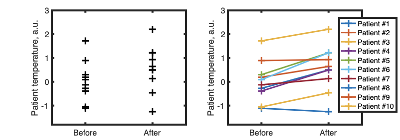
If we know that two conditions are applied to same sample (for example, we measure temperature of patient #1 before and after treatment) then it might be useful to show that using lines:

Example of line plot to show change in parameter before and after treatment. While most patients improved, there are some outliers. Paired-sample t-test, p<0.01

We sometimes want to show bunch of different stuff on the same plot. Consider this graphics, that overlays multiple fluorescence excitation spectra:

Spectral analysis of fluorescent variants GECO, Understanding the Fluorescence Change in Red Genetically Encoded Calcium Ion Indicators

It took me a lot of time to understand it, because it uses two sets of axes for each subplot. That can be an effective tool, and can be easily implemented, say in MATLAB [example one] [example two], but it can also cause confusion. Let’s focus and try to improve single panel:

Panel D. Color represent amount of Ca2+ ions, texture represents single- (F1) or two-photon (F2) excitation modes

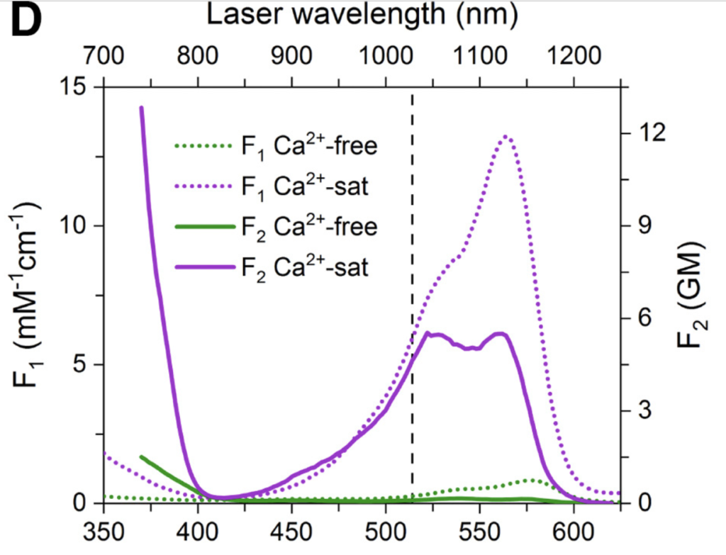
The plot is using color and dashing in order to define 4 different spectra of a calcium-sensitive fluorescent protein. Dashing is used to signify excitation mode (single-photon or two-photon) and color is used to mean presence or absence of calcium. This plot can be improved by flipping this relationship, keeping dashing for calcium amount, and keeping color for illumination mode:

Revised plot. Color now means means imaging conditions and matches axis

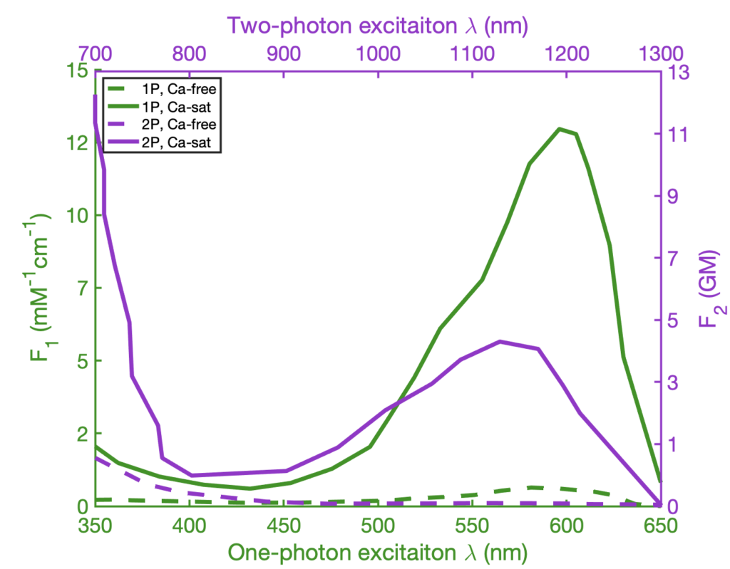
We can see, that least important information (plot of calcium-free fluorescence) is now hidden by dashing, and important stuff (the spectra of excitation) is elevated. We also color-coded the graph lines, as well as axis, so that two graphs can be viewed in the same panel, but also be distinguished visually: the purple line is being read using purple axis, and the green line is being read using green axis.

As final note, few resources on making graphics clear and statistically sound:

Run Journal Club as a project meeting

A lot has been written about Journal Club meetings in academia and medicine. It mostly boils down to something like “10 ways to kick-ass at journal club presentation” or similar. There is not much discussion on how to make Journal Club an effective tool.

This stems from the fact that nobody treats Journal Club meetings as business meetings. Journal Club becomes a “discussion” in a terrible sense: there are no quantifiable goals, no concrete questions to be answered, no tangible results that can be recorded. Perhaps one exception is clinical journal clubs where the concrete question is whether given research paper helps us to treat patients better.

In academic circles goal of the Journal Club is often “to keep up with the recent research” or “sharpen debate skills and critical thinking”. This is nebulous, unmeasurable, ultimately unachievable in any progressive fashion. The goal of this article is to offer tools that would make JournalClub meetings more productive by specifying set of goals.

First, person in charge of the Journal Club (the main stakeholder in the group) should state clearly goals of the meeting. For example, PI can say (and regularly repeat):

I want us to read papers and learn what experiments we can do better than others using our awesome technology

Or perhaps, we want to learn new statistical methods; or new optical techniques; or new model organisms. Or we want to borrow experimental approach; or compare our approach to another group’s one. That doesn’t matter, what matters is trying to be precise in the language.

That naturally allows for deliverable at the end of the meeting. For example:

  • List of statistical methods, that were used properly, and should be learned
  • A comparison of published experiment with potential experiment achievable with technique available in your lab
  • A published experiment that we should do with another transgenic line or animal model
  • An engineering trick that can be borrowed or improved
  • List of mistakes authors made, including wrong methods or strong assumptions
  • Critique of the figures for clarity and information density; how figures can be improved

When the goal is set precisely, the meeting turns into a work meeting to achieve a goal, and not a discussion to kill time. Participants now have a sense of purpose, common goal, and at the same time responsibility. Members of the team know when the meeting is “done“, that is when the goal is reached.

Journal Clubs are often seem to be a terrible way to spend time, and we would argue that is because the goal-setting is too abstract or even never provided. The public and loud statement of the goal from the senior managers (PIs) would provide concrete reason for everyone to be in the room and simple checklist-style way to know that meeting is a success.

PS: useful general dichotomy can be “paranoid vs reparative reading

Free resources to practice programming languages

This short list covers few sources of practice for Python, MATLAB, R, and Javascript

MATLAB

Main source: official tutorial MATLAB Academy.

Bonus points for problems from MATLAB certification practice test.

Extra bonus points: online interpreter of Octave with functionality of shared coding. You can loop in another person to help you get through. GNU Octave is designed to be compatible with MATLAB syntax

Python

Interactive Python exercises

36 exercises for learning Python. It does require having development environment set up, and might require someone to help you at the beginning.

R and RStudio

Swirl is a library that you run inside RStudio, that guides you through tutorial

There is also an interactive online tool, LearnR hosted on RStudio’s Github

Javascript

There are many services that allow practicing JS. But we like Javascript because it can be useful for programming dynamic data visualization. Online platforms such as Glitch, Codepen or JSFiddle allow free-of-charge prototyping and sharing of small web applications.

Getting through a slump: Paired Sciencing

Almost all scientists hate writing and editing. Many find careful reading of scientific literature very difficult and energy-consuming. Finishing these tasks can take very long time, especially closer to the end. Remember, work scales with 80/20 principle: 80% of time is spent on 20% of the task.

By applying Paired Sciencing method we were able, in some instances, to get over the slump and finish stalled tasks.

The basis of Paired Sciencing follows from the Pair Programming technique of The Agile methodology. The aim of pair programming is to work on a single piece of software simultaneously with partner, so that number of bugs will go down and problem-solving will be more efficient with 2 pairs of eyes. The goal of Paired Sciencing is simpler: leverage accountability in the group to get through tasks that would be otherwise delayed or avoided till the last minute.

The practice of Paired Sciencing goes like that:

  1. Pick up a partner of several, agree to participate in Paired Sciencing session.
  2. Pick a date, time, and location. Book a conference room with a door (shared offices or open space won’t work). Ideally, it will be in an unusual, yet comfortable location. Sometimes you can get away from lab and book a quiet library space.
  3. Use time-box: agree that you will work for limited time (for example, an hour).
  4. Pick task or tasks that can fit in the time-box. Articulate to all your partners what you will be working on.
  5. Get in the room, close the door, set up timer for the duration. Now, keep silence and write/read/code/study
Leave phones in a special basket

Hopefully, you and your group will be able to provide necessary support to get to the end of the timer with all boring work out of the way.

AP Photo/Rizza Alee

The art of reporting incidents

During my PhD, I have been responsible for several pieces of lab infrastructure (data storage, microscopes). To learn how to be responsible service provider, I have watched many videos (Tom Limoncelli, Alice Goldfuss) and even purchased couple of books (best is The Practice of System and Network Administration).

What I’ve learned is that network/system/computer administrators have figured pretty good way to manage infrastructure, manage expectations, and make sure systems with users run smoothly, while minimizing pain for people in charge. We can borrow a lot of this knowledge and reuse it in the setting of research lab.

One aspect of managing systems is response to incidents. That is basically when bad or unexpected stuff happens, no matter the reason. For example, the university network stopped working. Or there is an electrical outage. Or I have done some configuration change that blocked all users from accessing their data.

All of this events have one in common: there is something affecting service beyond original expectations of the user. The first step in remediation, often, must be clear and honest communication of the situation to users, or any interested party (think students who use system but also PI who runs the lab). We often see that this is not done clearly enough, or at a right time, or using the right tools.

Bad way to report incident: piece of paper on the outside of the building; no official emails; no alarms raised inside

Base of my thinking about it was stolen shamelessly from Tom Limoncelli (for example, Radical Ideas Enterprises Can Learn From The Cloud)

The way we inform people of any issue should follow this minimal checklist:

  • Inform in timely fashion, hopefully as soon as issue was discovered and initial assessment was done. It depends on relative risk of the condition. If we suspect gas leak, we should not wait and inform all parties immediately. If fridge seems to be broken, we should first check if it was plugged in before reporting.
  • Be clear about the incident area. “There is an issue with system” is not as clear as “The network connectivity is dropped since 10am”. The purpose of communicating as much as possible is to reassure the everyone that you are on top of things and transparent about what’s going on. Also it removes unnecessary worries, as “Data is unaccessible due to network issue” makes it clear that data is still intact.
  • As you describe what had happen, make sure to include things that didn’t happen (to the best of your knowledge). The network is down, but data is safe. The power in room 123 is off, but emergency power in room 123 is still running, so the microscope is still working. The fridge seems to be broken, but temperature sensor still says -20C.
  • Be clear about what has been done so far to investigate and remedy the issue. “Something happened with lights in room 321, we called facilities” conveys that you are on top of things.
  • Make sure to be clear that you will update people on the issue. It might be not your job to fix the issue, but it is your job to communicate. There is no electricity? Cool, provide a contact for person in charge or be the point of contact. It is OK to delegate or give a way responsibility. “Contacted facilities, please refer all questions to John Doe, as there is nothing I can do” means you managing people’s expectations and provide transparency once again. Ideally, provide time when you will update (“Will report back by 4pm with updates”).

Making sure you check all these boxes in your very first email / report about the incident will allow people to make decisions about their work; it will provide confidence that this incident is dealt with professionally; it will save your time by avoiding people asking question like “has X been affected” and “who should I contact about this”.

How to write top-down

Just had a conversation with fellow PhD student about writing experimental design, or Methods section. Top-down principle suggest starting with very broad strokes and go down by refining each item. In our case it looks something like that.

Draft 1:

  • Mount fish
  • Image fish
  • Present stimuli
  • Process data
  • Analyze data

Let’s assume, we’ve decided that is enough writing for the day. But tomorrow we can come back and have energy to work on one of these item. For example, numbers (2) and (3). Our Methods section is turned now into:

Draft 2:

  • Mount fish
  • Image fish
    • Prepare microscope: select filters, laser lines
    • Set up imaging parameters: Z resolution, XY resolution, temporal resolution, scanned Z extent, temporal extent
  • Present stimuli
    • Add projector to the microscope
    • Program projector to present images to the fish
    • Set up parameters: intensity, time delay, randomization seed etc
    • Present visual stimuli A, B, C
    • Control for intensity
    • Control for spatial location of stimuli
  • Process data
  • Analyze data

This allows us to work on part of the bigger work, instead of trying to write whole section at once. It also allows making small notes on what should be there, so it is easier to remember and fill-in the details later.

Draft 3

  • Mount fish
  • Image fish
    • Prepare microscope: select filters, laser lines
    • Set up imaging parameters: Z resolution, XY resolution, temporal resolution, scanned Z extent, temporal extent
      • Z resolution: 5um for single-cell resolution, 0.5um for sub-cellular imaging [reference; reference]
      • Camera pixel size is 6.25um, so if we use 110mm tube lens we have 32X magnification with 20X Olympus objective (default tube lens is 180mm) [reference]. Pixel size then 6.25um / 32x = 0.19um = 190nm
      • Temporal resolution for nuclear GCaMP is ~5sec [reference]
  • Present stimuli
    • Add projector to the microscope
    • Program projector to present images to the fish
    • Set up parameters: intensity, time delay, randomization seed etc
    • Present visual stimuli A, B, C
    • Control for intensity
    • Control for spatial location of stimuli
  • Process data
  • Analyze data

Each pixel of presentation costs you $$$

Reprinted from dev.to

Which one of these images have higher pixel-to-information ratio?

Today I’ve been going through slides with fellow graduate student and came up with an analogy:

Each pixel of your slides costs you money

Now, consider how much you get back from each of the pixels you put out there. Was it really worth it? How much information did you provide, and how much have you paid for it?

In a sense, it is similar to “Data-ink ratio” idea introduced by Tufte. Difference is that “money” approach brings actual numbers to the stage.

When you put stuff on a slide, or on a plot, do you really get the most bang for the buck?

Most of the time, especially for the first 4 drafts, the answer is “no”.

How to get higher return on pixel?

  • Simplify: slide has to carry a message, how much simpler can it get?
  • Split: there has to be single message, can you say one thing at a time?
  • Squestion: does this has to be here?

Not only StackOverflow: Making use of Stack Exchange

We all know and love that great Q&A website, stackoverflow.com (or SO)

Well, we all should know and love it. But not many people I’ve met are aware of great variety of communities built using SO platform. Here are some of the favorites.

academia.stackexchange.com

Ask or search existing questions for anything about higher education:

  • how to deal with publications
  • finding and communicating with advisor
  • working on group projects
  • how academic departments work
  • what is expected from students, postdoc, RAs, TAs etc

WORKPLACE.STACKEXCHANGE.COM

More general site for discussion of anything related to professional workplace. After all, we are working in academia and science too. This is perfect for students, trying to transition into research, since it covers:

  • relationships in the team
  • how to ask for raise, promotion
  • what is expected from professionals
  • “Is this behavior professional and how should I deal with it?”
  • workplace issues, conflicts, harassment
  • management “up” and “down”

interpersonal.stackexchange.com

Less known, but still useful site focussed on interpersonal relationships. There is a trope that some academics are not so good at communicating with friends and family, and this site might help.

codereview.stackexchange.com

For when we are done hacking our code and would like to make sure that it is at least reasonably written. Software is often a part of scientist’s job, so it should be done reasonably well